The new Agritech logo reflects the continuous philosophy of modernization and innovation that the company has been pursuing for years.
This restyling has been designed with the aim of perceiving a new awareness of innovation and renovation in the identity of our brand.
We have maintained our classic design but by giving an extra touch of elegance and minimalism. The colors have a double shade of green and red, thus expressing a sense of versatility and ample competence to the brand and the company.
Even the Agritech lettering is much lighter and with the most harmonious lines, although it always maintains a strong character that expresses solidity and stability.
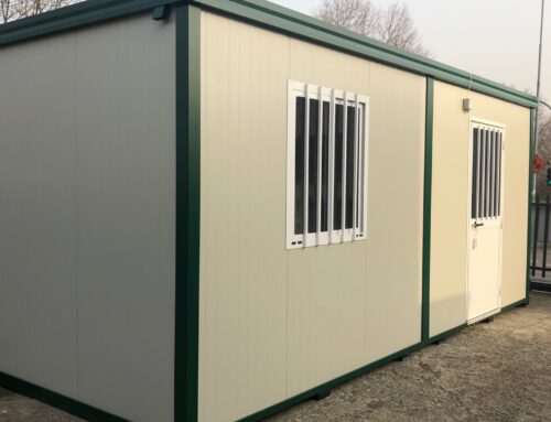
The new version is much more compatible and pleasant for the visual approach of the web, but it also applies perfectly to the brand’s vision over our products, as you can see from the photos in the product galleries.
Signed
Agritech: Storage & More